
Quickstart with sample taxi fare model
To start your free trial, sign up at the following location: https://vianops.ai
Imagine you work for a New York City taxi company. 🚕 Your company has an app that shows potential riders an estimated fare for their trip based on pickup location, destination, map distance, and estimated ride time. Accurate predictions are important in keeping customers confident in your fare estimates when they compare a taxi ride with alternatives.
You are responsible for maintaining the model that makes the fare predictions.
VIANOPS is the tool you depend on to help you in this task.
Note: Check the glossary for a refresher on the definitions of terms used in this topic.
The problem - a drop in performance
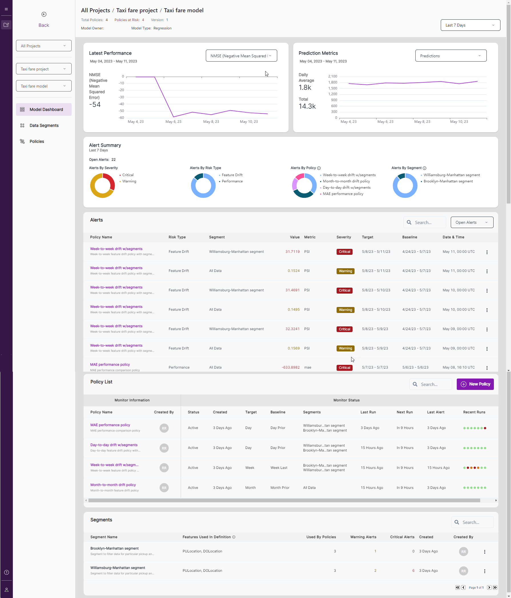
Today you open VIANOPS to find a significant drop in all the model performance metrics starting a few days ago.
In the Alerts list, you notice the number of alerts has been rising and many are critical, including the feature drift policy for the Williamsburg to Manhattan segment.
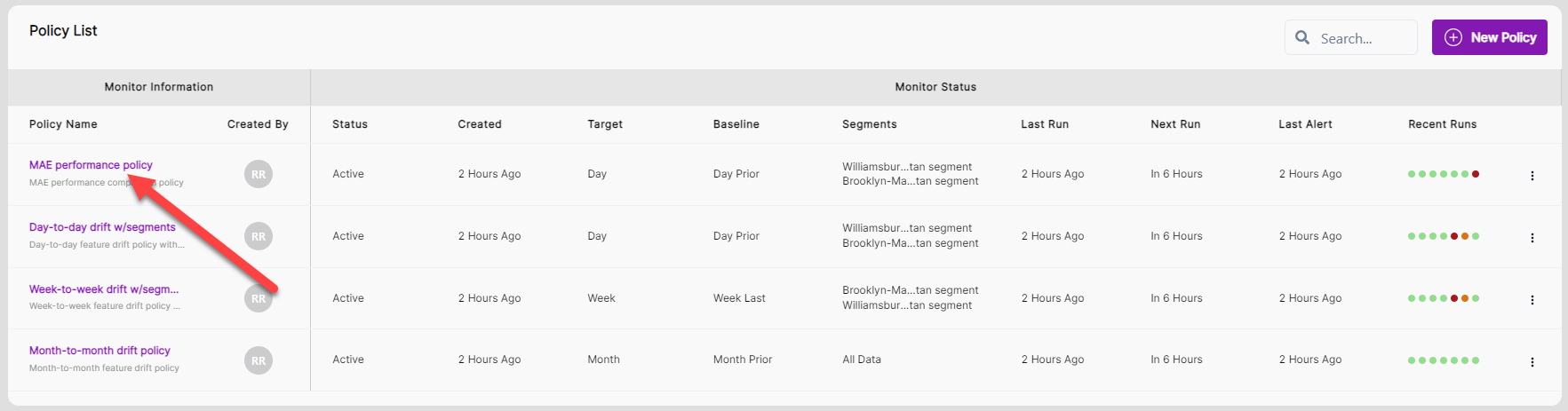
You can review that for this scenario, four drift policies (Policy List) are running and two segments are defined (Segments list).
To diagnose the problem, you do the following actions:
-
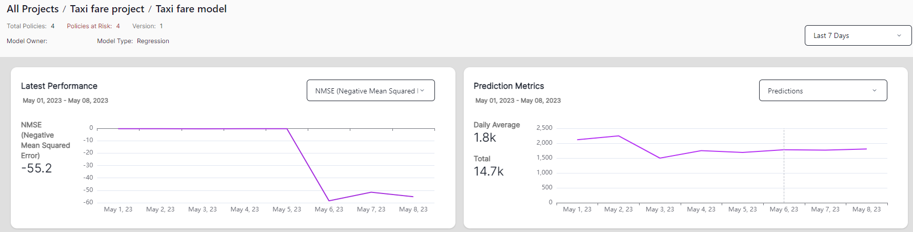
Change the date range selector in the upper-right of the screen to Last 30 Days and Last 90 Days.
The performance had been stable up until two days ago.
-
Change the date range selector back to Last 7 Days.
-
Go to Alert Summary and check the distribution of alerts across four different perspectives: severity, policy type, policies, and segment. Mouse over the donut charts to see more details.
-
In the Alerts section, click the Severity column header to sort the alerts by severity.
-
Most of the critical alerts occur in the Week to Week drift w/segments policy (Policy Name column) and Williamsburg-Manhattan Segment (Segment column). Review the target window and baseline window to see the difference of date range.
-
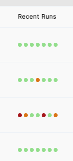
Scroll down to Policy List to see the four policies created for this model. Recent Runs gives you quick insight into whether any critical (red dot) or warning alert (orange dot) was triggered in the last run. For example, you may notice the month-to-month policy is the only one without either warnings or critical alerts.
-
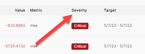
Find and click the MAE performance policy to explore model performance further.
-
Expand the Policy Information section to see the Policy Type is Performance to compare the current day’s performance to prior day’s performance, and the Thresholds is set at 20 for warning and 50 for critical.
-
Collapse the Policy Information section and scroll down to the Percentage change in mae chart.
-
Click on the circle where you see the biggest drop in performance. You can see the alert on the left becomes highlighted and the Performance Details chart underneath changes to show the Williamsburg-Manhattan segment, Selected Date, and other values in the table.
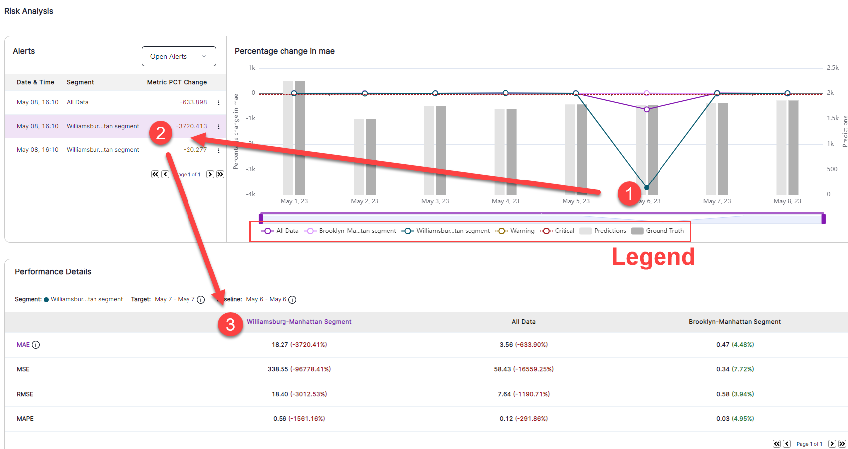
- Click on the Williamsburg-Manhattan segment and All Data in the legend.
- Notice how the chart reflects more details of the performance in Brooklyn-Manhattan
- Notice the change of the Y axis scale as a measure of percentage change in MAE.
-
On the Performance Trend chart, you can see the actual performance trend for all data as well for the two segments: Williamsburg-Manhattan and Brooklyn-Manhattan. Notice Williamsburg-Manhattan has a significant performance drop while the performance is stable in the Brooklyn-Manhattan segment. The performance in the Williamsburg-Manhattan segment is significant enough to have an impact to All Data.
-
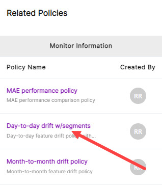
Go to the Related Policies chart at the bottom of the page and open the Week-to-week w/segment policy. Note that you can click other policies in the Policies link on the left navigation bar of the Model Dashboard.
-
Click the Week-to-week Policy, expand Policy Information. You can see the policy type is Drift Distance, the Target Performance is a week, and the Baseline Performance is Last 2 weeks.
-
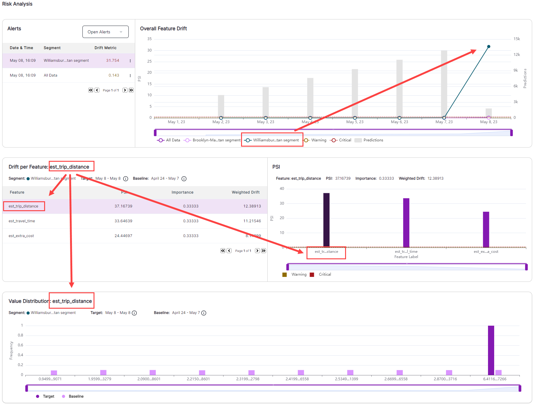
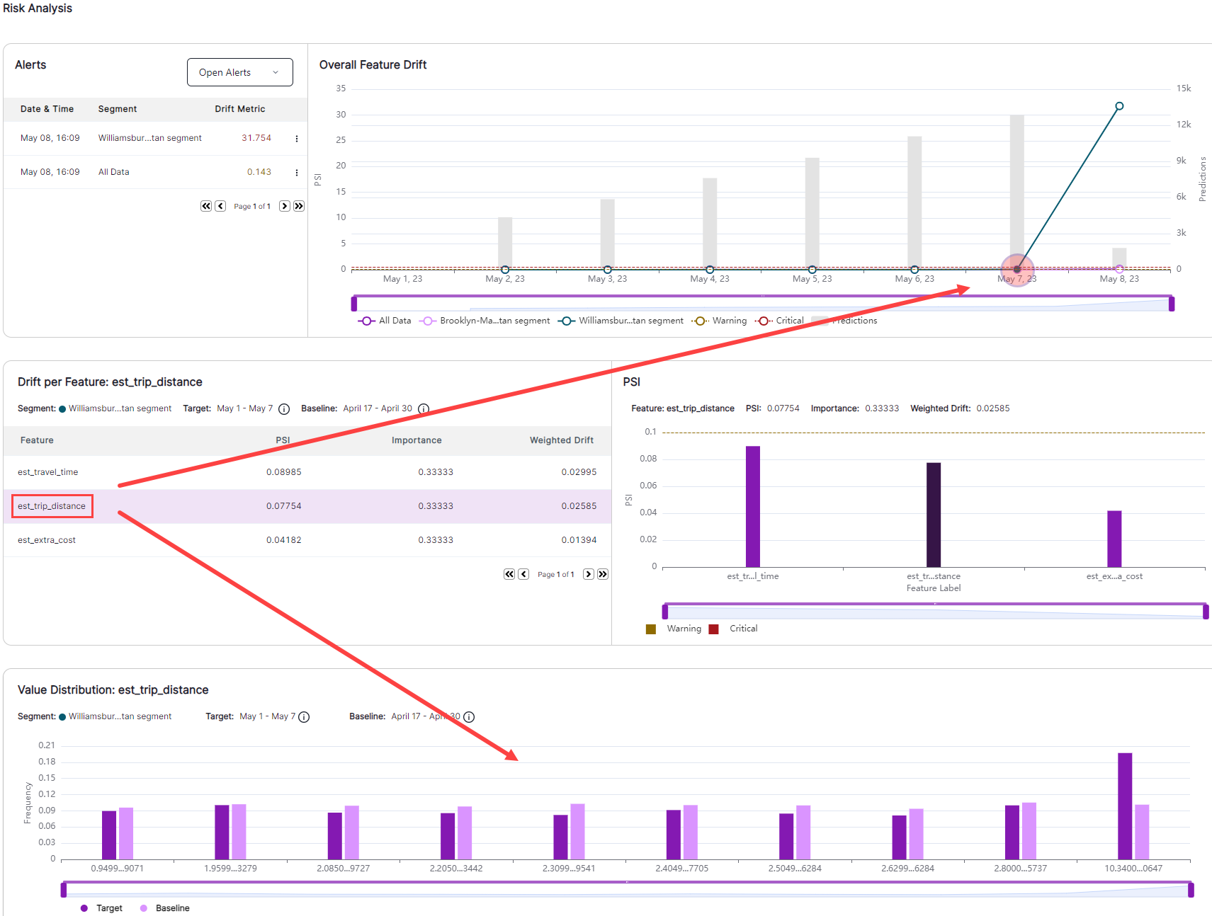
Go to the Overall Feature Drift chart. You can see the drift of Williamsburg-Manhattan segment continues to increase more than the drift in the Brooklyn-Manhattan segment as well as in All Data.
-
Click the circle of the Williamsburg-Manhattan segment which has high drift value, and note that the charts below are refreshed based on the selection to reflect the corresponding target and baseline window in this segment as well as the level of drift for each feature in this policy.
-
Click the est_trip_distance feature, and view the Value Distribution chart. This shows the value distribution comparison of the target (current week to date) and baseline (last 2 weeks) for this feature. Notice the est_trip_distance in the target window shows the majority of trips were longer in distance while baseline window has more equal distribution across short and long distances.
-
On the Overall Feature Drift chart, click the circle on the Williamsburg-Manhattan segment for the day prior to when drift was first observed. Select the est_trip_distance feature again in the feature list and notice the Value Distribution chart shows a similar distribution for the feature between target and baseline window.
-
Select other circles for All Data or the Brooklyn-Manhattan segment, and repeat the same steps as above by selecting one feature in the list and view the comparison of the value distribution between target and baseline window to understand the change.
-
Drill down further to understand when drift occurred, and identify factors that point to why the drift occurred. Open the Day-to-day w/segment policy either by clicking on the link in Related policies or from the left navigation bar.
-
Notice the spike when drift first occurs. Note also the downward line the next day that indicates drift has continued; that is, drift did not change from the prior day.
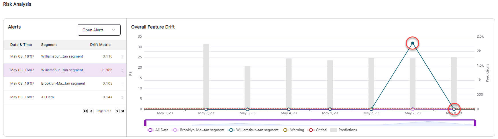
- Select a circle in the Overall Feature Drift section, and perform the same observations as you did in the Week to week w/segment policy; select a feature and check out the value distribution of this feature in the target window in comparison to baseline window.
Summary
Based on all the metrics you have observed, you know there was a significant change a few days before opening this model dashboard in the Williamsburg – Manhattan segment, and it is ongoing. A quick internet search reveals that a two-week construction project began on the day that estimated travel time spiked. Because this is a temporary problem, you do not need to retrain your model; you instead add a courtesy pop-up message on your app to alert customers who select rides for that segment that travel times might be higher during the next few days due to construction.